AI search: how to optimize your website (and hot takes from INBOUND25)
The last few years at HubSpot’s annual INBOUND conference have been “all about AI.” This year? Inbound 2025 was less hype and more real-life...
Take full advantage of the new and improved HubSpot CMS experience with the CLEAN theme.
Have a question and looking for an answer? I've likely got a video for that or an article that covers it.
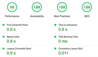
Google PageSpeed Insights is the gold standard in analyzing the speed and performance of a website. Here is how CLEAN Pro ranks. Not too shabby for a media-rich page.

Report generated: Tues, March 7, 2023, based on Home Page - Opt 1.

Need inspiration for your next PDF booklet offer or lead-capture landing page? Searching for good examples can feel like finding a needle in a haystack, but we’ve got you covered. Read on for the key elements every high-converting page needs and design features to keep you up-to-date.
An effective landing page focuses on a few elements:
You’ve seen these all over the web: buttons that read “Submit,” “Click here,” or something equally dull. Get creative and try something like “Send me your Secrets” or “YES, count me in” to add intrigue and help the reader identify with the action you want to encourage. Choose a button color that pops on top of your background, and make sure your CTA is visible above the fold, so your visitors won’t need to scroll down to see it.
Don’t give your possible leads easy access to your main website menu. If they stumble upon it, they could get lost exploring other pages and never return to your initial offer.
Would you speak to an infant the same way you address your boss? Unless he’s the Boss Baby, chances are slim. Figure out who your page is for, then write the heck out of your offer. Good writing converts. Plain and simple.
According to HubSpot, 90% of people believe brand recommendations from family or friends, so testimonials and reviews can pack a real punch.
We could write a whole separate post on how to build a kick-ass landing page (in fact, we did!), but in the meantime, here are a few landing page examples that are both compelling and cool.
Built with HubSpot
First up, we have the landing page for HubSpot's marketing platform. You’ll notice that this example includes trendy elements like images with drop shadows and a chatbot to field questions from visitors.
But the design on this page is more than just pretty: it’s functional. You can see the CTA in button form at the top and bottom of the page, giving visitors a few chances to take action. Also, HubSpot places the same CTA in a hyperlinked text format, which feels less intimidating than a large-and-in-charge orange button. The well-balanced text and images make the page easy to skim as you scroll.

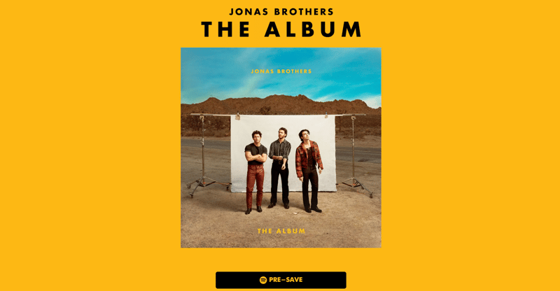
Built with presave.io
Next, we have the landing page for the Jonas Brothers' latest album. Just look how minimal it is. The large text against the solid background directs fans to take action (pre-save that album!). This simple landing page design is helping them build lots of buzz for their music (although being famous probably doesn’t hurt either).
Fun fact: their new main website is on our CLEAN Pro Theme for HubSpot.
Built with Unbounce
Brandfolder’s landing page boasts a very stylish design. Its vibrant gradients, asymmetric wave section separators, and interactive chatbot make this page eye-catching. It features legit testimonials and a consistent CTA, “Schedule your demo,” which offers visitors several opportunities to take the next step and boosts the page’s conversion power.
Built with the CLEAN Pro Theme for HubSpot
Moving on to the landing page for Koncert's email marketing checklist. It’s a classic example of meeting your visitors’ needs by offering a free resource (aka lead magnet) in exchange for an email address.
The page makes Koncert look cool with its custom illustrations and use of organic shapes, curves, and subtle gradients. The current design and value help Koncert stand out as a trusted resource for its potential customers.
Built with HubSpot
Workable’s landing page for its hospitality recruitment platform includes several contemporary design features, including asymmetrical section separators and custom illustrations. Its sticky scrolling form is a visually enticing alternative to showing a single CTA in multiple spots on a page (although the latter might be easier to track).
This page is also a great example of using social proof to build trust, with reputable awards and glowing testimonials from well-known brands. Plus, the landing page links to an additional video testimonial page. According to Wyzowl, 2 out of 3 people say they’d be more likely to purchase after watching a testimonial video demonstrating how a business, product, or service had helped someone like them, so Workable is wise to follow this trend.
Try out your design chops with our brand new Figma file for CLEAN.

The last few years at HubSpot’s annual INBOUND conference have been “all about AI.” This year? Inbound 2025 was less hype and more real-life...

Not a developer? No problem. This post is for you if you want a fast, drag-n-drop way to create your own website templates in HubSpot.

Have you ever landed on a website that made you think, “Am I in the right place?” Yeah, me too.