5 Modern Landing Page Examples to Inspire You
Need inspiration for your next PDF booklet offer or lead-capture landing page? Searching for good examples can feel like finding a needle in a...
Take full advantage of the new and improved HubSpot CMS experience with the CLEAN theme.
Have a question and looking for an answer? I've likely got a video for that or an article that covers it.
Google PageSpeed Insights is the gold standard in analyzing the speed and performance of a website. Here is how CLEAN Pro ranks. Not too shabby for a media-rich page.
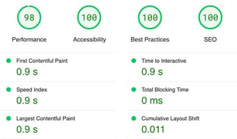
Report generated: Tues, March 7, 2023, based on Home Page - Opt 1.
6 min read
![]() Kevin Fremon
:
October 18, 2019
Kevin Fremon
:
October 18, 2019
Updated: 11/14/22
The fun of creating landing pages is that it gives us the ability to experiment with design, copy, offers, etc. in order to capture the attention of our target customers. Ultimately, converting them into leads.
There is a tendency by a lot of marketers to only focus on the offer and not give design and UX the consideration it deserves. With the incredible amount of ads leading to landing pages that we all are bombarded with in our social feeds, it's more important than ever to stand out from all the other landing pages trying to capture the attention of the same audience.
In this post you'll learn how you can create the best landing page designs and what design trends will be crushing it in 2023.
Landing page optimization is both an art and a science. There are several key elements that make up a great landing page experience for a visitor such as:
These elements need to be continually enhanced and tested over time in order to find the best performing landing page variation. As much as we'd all love it to be the case, it's just not possible to create the PERFECT landing page on the very first attempt. It will take some iteration to see the awesome results you're after.
The good news is that HubSpot makes it super easy to run A/B tests to help you understand which page variation is performing best.
As consumers, we live in a time where there is a plethora of choice when it comes to considering and making a purchase decision.
During the consideration phase of the buyers-journey, the first impression of your brand happens in a split second. 17ms according to a study by Google's research team in attempts to understanding aesthetic judgements people have in regards to first impressions of websites.
17ms... Wow!! That's fast, but not surprising. It's a pretty safe bet that we've all landed on a website and instantly thought "NOPE!" and closed the tab.

An awesome landing page design will help your brand visually communicate quality, trust, and keep you a few steps ahead of your competition. At the end of the day resulting in higher conversion rates and new customers.
2023 is here which means its a great time to start refreshing your website and landing pages to stay at pace with the leading trends in web design.
Here is a list of the best web design and landing page trends for 2023:
The proper use of background video on a landing page can take your plain-jane, static design to something a lot more engaging for visitors. Much like in this example by DITTO.
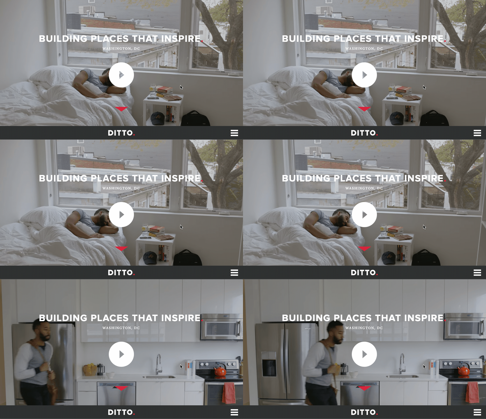
Even with how cool background videos can be, there are certainly ways where you can mess it up and hurt the performance of your landing page and the experience people have. So, let's go over some basic rules to keep in mind.
If you're looking for a place to find cool, high-quality video clips to add, I'm a big fan of Stocksy.
One of the simplest ways to get your value proposition to leap off the page is to make the font much larger. This trend has quickly started to emerge as we're now better understanding how people read online. Especially since we are all bombarded with information each day.
Take a pause and think about how you're reading this post. I bet you did at least three of the following:
Our online reading behavior has changed and it's important that we take into account the skimmable content on the landing pages we create.
Let's take a look at one of Lyft's current landing pages. Here, above the fold you can see they are driving home the point with their headline.
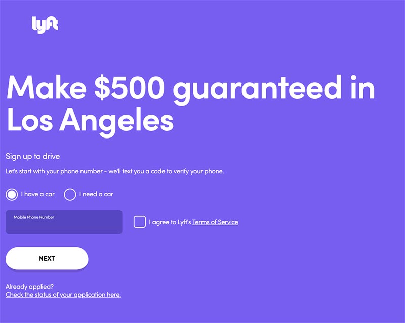
They don't just stop there. As you scroll down the landing page they are leveraging oversized typography throughout the experience.

Working with typography and font-sizes can be a bit of a challenge when it comes to getting each size to look nice together. A tool I'm a huge fan of and use all the time to decide on font sizes is called TypeScale.
We've all heard the saying that "less is more" and there are many cases when that is true. Especially when it comes to landing page design.
CLEAN (pun intended), minimal design is all about streamlining both written and visual content so that it doesn't visually overwhelm a visitor when they first hit your page. This has two main benefits.
A great example and one I referenced when creating the CLEAN template series for HubSpot is by Shopify.
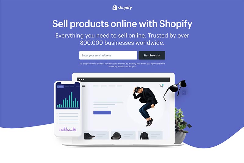
This simple design allows for visitors to quickly digest the details that matter. Often times resulting in a higher conversion rate.
If you've been to my website, you'll know that I'm a huge fan of live chat. Including this feature on your landing pages can help visitors decide if your product or service is right for them by answering their questions in real time.
Not only that, but you will be able to get an even better sense of customer objections and can you optimize your content to handle them.
Live chats are also a fantastic way to create a connection with potential customers by building trust and rapport.
Here is an example of how ProfitWell is using live chat on their landing page.
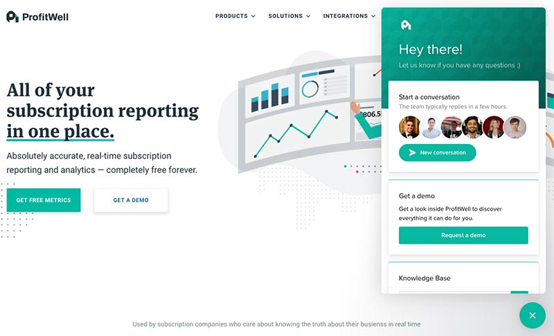
We're all used to seeing standard shapes such as circles, squares, rectangles, etc. used for web design. A trend that we will begin seeing a lot more of in 2023 is the use of fluid, organic shapes.
These types of shapes when paired together and used correctly can create a visually appealing page that is soft yet directive to the eye. At the same time, communicate friendliness and approachability.
In this landing page example from HubSpot, you can see how the subtle addition of organic shapes gives the otherwise clean and professional page a nice design punch up.
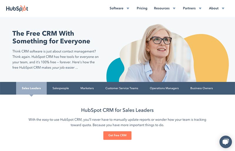
A big trend that's sure to grow in popularity in 2023 is the use of custom illustrations.
This comes as no surprise as quality stock photography that doesn't come across as completely inauthentic can be quite hard to find. Not to mention, a custom photoshoot can be quite expensive.
Enter custom illustrations. This style of illustration has the added benefit of being able to visually communicate a variety of aspects of your offer, and they're eye-catching and original.
You can see in this example how Asana is incorporating them into their brand.
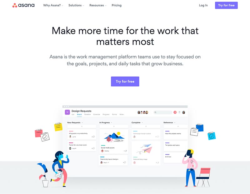
If cost and time are prohibiting you from having custom illustrations created, another great resource that I've used many times is Creative Market. If you search "isometric illustrations" you'll find a variety of options.
Whether you like it or not, your leads will research your competitors, so you might as well help them find what they're looking for on your website. Give them a leg up (and build credibility) by showing price or feature comparisons.
For example, here's how Monday.com helps its website visitors compare their platform with Asana.
According to a 2020 study by Wyzowl, 2 out of 3 people say they’d be more likely to make a purchase after watching a testimonial video demonstrating how a business, product or service had helped another person like them.
Think it's a good idea to use video footage on your website of real humans? You're right! Loom does this well, and is a helpful tool for displaying and recording video.
Want to increase conversions on your landing pages? Reduce the number of choices your website visitor has to make by removing navigation links in your footer like in the example below from Typeform.
If you're using my CLEAN Theme for HubSpot, I've included a simple toggle for this.
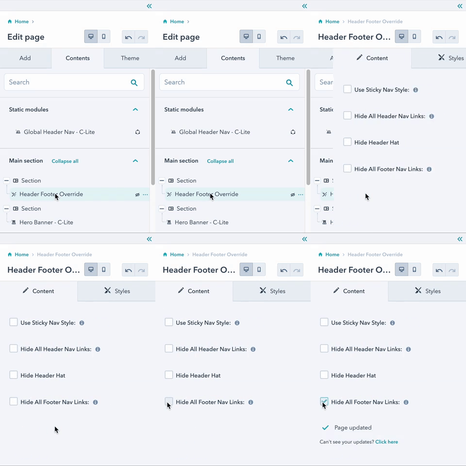
Voila!
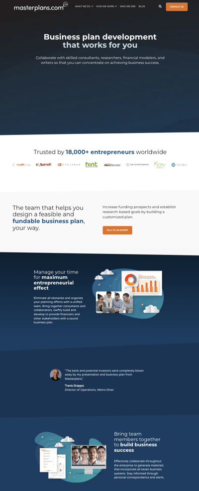
Breathe a little life into your site with fluid wave borders, like Masterplans.com in the example below.
It's subtle, but it has a less rigid feel than traditional straight lines and edges.
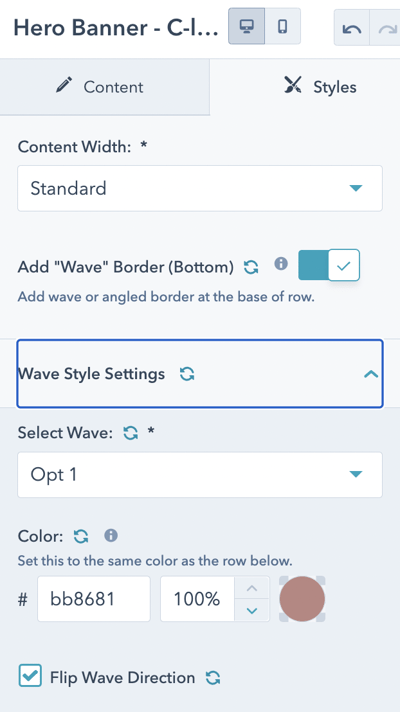
CLEAN offers a few different wave styles, depending on the look you're going for.
The year 2023 will only bring new products, services, and offers for the world to siphon through. One of the best ways to cut through the noise and ensure that your brand and offer stands out from the pack is to understand how the design landscape is changing and adapt/test accordingly.
I encourage you to begin experimenting with these 6 landing page trends to find a winning landing page that has you converting leads all day long.
If you run your landing page experiments on the HubSpot platform, it's definitely worth checking out my CLEAN Theme (shameless plug). It will give you all the tools you need as a marketer to start upping your conversion rates today.
As you get to know me, you'll soon realize that I value feedback to a great degree. If you have feedback for me in regards to this post, I'd love to hear it. Just drop me a comment below.

Need inspiration for your next PDF booklet offer or lead-capture landing page? Searching for good examples can feel like finding a needle in a...

Is your website ready for 2026? Marketers like you can use these tried-and-true landing page examples (organized by industry) as inspiration to build...

Have you ever landed on a website that made you think, “Am I in the right place?” Yeah, me too.