10 Best Landing Page Design Trends that will Crush it in 2023
Updated: 11/14/22The fun of creating landing pages is that it gives us the ability to experiment with design, copy, offers, etc. in order to capture...
Take full advantage of the new and improved HubSpot CMS experience with the CLEAN theme.
Have a question and looking for an answer? I've likely got a video for that or an article that covers it.
Google PageSpeed Insights is the gold standard in analyzing the speed and performance of a website. Here is how CLEAN Pro ranks. Not too shabby for a media-rich page.
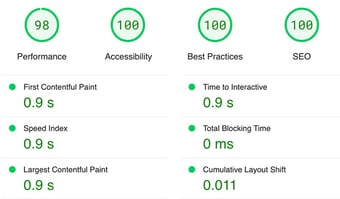
Report generated: Tues, March 7, 2023, based on Home Page - Opt 1.

To all my fellow designers out there, this one is for you. Today, I'm excited to announce the release of version 1.0 of the CLEAN Pro Figma file. You've been asking for it and I'm happy to finally make it a reality in an effort to help streamline your design workflow.
Like my approach with CLEAN, this Figma file will be a constant work in progress with consistent version updates over time. Version 1.0 is intended to get you movin' and groovin' in your wireframe process with a majority (not all) of the existing CLEAN modules.
When opening the Figma file for the first time you'll see the Pages section under the Layers tab. I've done my best to make this as intuitive as possible.
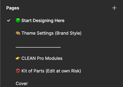
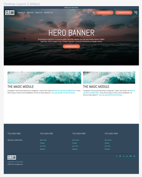
For the most part, you can start building layouts by clicking Start Designing Here. That will include a starter layout with the header, footer, hero banner, and magic module. These are really just placeholders to give you a starting point.
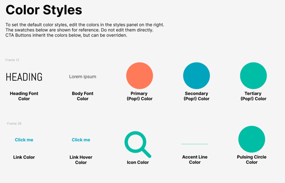
From there I would suggest that you head over to the Theme Settings (Brand style) to dial in your fonts, buttons, and colors that many of the components (modules) will use. Here you'll be able to change a variety of aspects. This is just one example.
There are a couple of ways to do this but the way I suggest to avoid confusion is to simply click the Assets tab in the left-side panel to see the list of custom modules included.
Simply drag them into your layout.
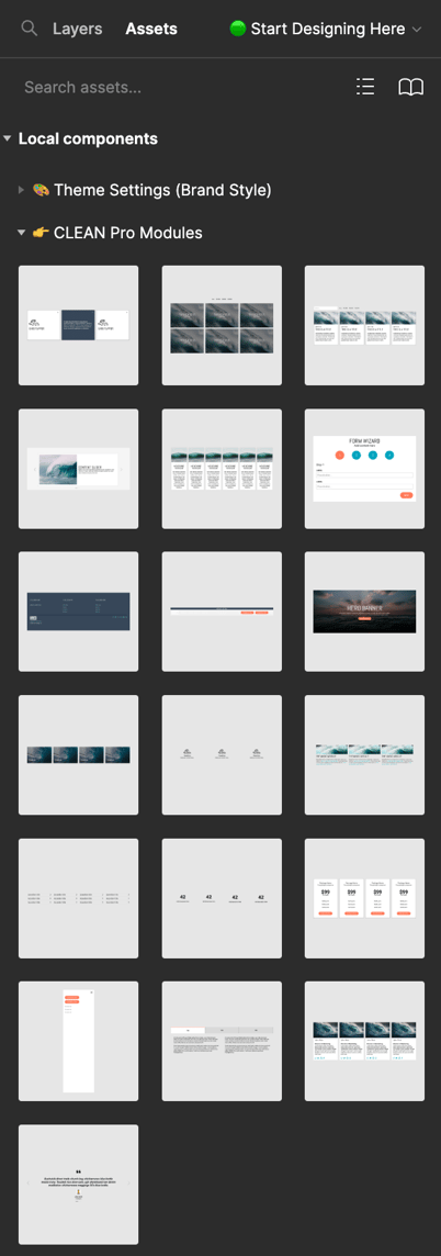
The same can be done for smaller elements like buttons, form elements, etc.
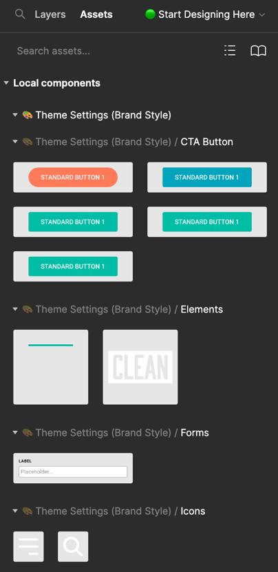
As you know, CLEAN modules have a lot of built-in flexibility when it comes to selecting how many columns you want as well as the column structure. Building all these options into a Figma component is nearly impossible but there are a few options for you to use.
When double-clicking on a component you'll see some options appear in the right sidebar. For example, the number of columns.

Definitely explore these. They aren't perfect but they will definitely save you some time.
As I said, this is the first release of this Figma file and it's only going to get better from here on out. This is where I need your help. If you see anything that can be improved, I would really appreciate you letting me know.
Together we can make this awesome and give you yet another tool in your design arsenal.

Updated: 11/14/22The fun of creating landing pages is that it gives us the ability to experiment with design, copy, offers, etc. in order to capture...
.jpg)
Ready for your big and exciting new website design? Before diving into the fun of drag-and-drop editors and page layouts, make sure you’re building...
Wondering which website platform is right for you? I’m here to help you weigh the pros and cons of a few key players: WordPress, Squarespace, and the...