How to get buy-in when you need a new website
Frustrated with your outdated website? You may get the vibe that your lack of data or user experience is creating more roadblocks than it’s helping.
Take full advantage of the new and improved HubSpot CMS experience with the CLEAN theme.
Have a question and looking for an answer? I've likely got a video for that or an article that covers it.
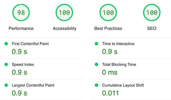
Google PageSpeed Insights is the gold standard in analyzing the speed and performance of a website. Here is how CLEAN Pro ranks. Not too shabby for a media-rich page.

Report generated: Tues, March 7, 2023, based on Home Page - Opt 1.
5 min read
 Miriam-Rose LeDuc
:
November 29, 2021

Do the words website audit make your stomach churn? I get it. The idea may feel technical and intimidating, especially if you’re not sure how to get started. The good news is that a website audit doesn't have to be complicated.
Think about it this way: if you were hosting a party, you’d want to make your house look good for your company, right? Your website is no different. It’s where you welcome your online visitors. And if this is your shindig, you need to help your guests find what they’re looking for (and have a good time!).

These three Cs are central to your site strategy. So, how do you know if your website is hitting each one? Here are some elements you should check:
How do you help your prospects find your site?
Sure, SEO can be technical, but it’s necessary to help your prospects find you. You can’t connect with them if they don’t know you exist!
SEO specifics to check:
☑︎ Define Your Keywords
Put yourself in your customer’s shoes. What questions do they have? What might they be searching for online?
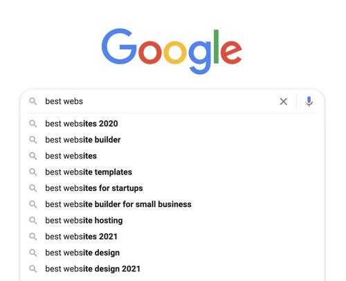
Try typing search terms into the Google dropdown search box. What suggestions do you see? Google may serve you some of the keywords your prospects are using.

Are you actually ranking for any of these topics? And if you’re not, who is? What are they doing well?
Check out tools like Moz.com to see how you hold up to the competition for search results.
Remember that single-word keywords and general terms can be competitive and tricky to rank for. The more specific you can get, the better! For example, instead of websites, you could try something like best website platforms for beginners.
Remember not to overuse your keywords. This is known as keyword stuffing and is frowned upon by the Google gods. Use them in your URLs, titles, meta descriptions (more on these in a second), and other essential places, but sprinkle synonyms throughout your body copy to increase your chance of ranking in search results. Plus, your writing will be more fun to read.
☑︎ Write Meta Descriptions
This is the bit that appears under your headline in the SERPs (Search Engine Results Pages).

You should be able to easily add a meta description in your website platform’s editor. Just make sure it’s no longer than the recommended 155 characters.
Note - Google takes these descriptions as suggestions and optimizes them to match each search. There’s, unfortunately, no way to guarantee that your meta descriptions will appear as you hoped in the SERPs since you have no control over how well your description will match every unique search term. But it’s still better to have a meta description than to leave things up to chance.
☑︎ Use Appropriate Header Tags
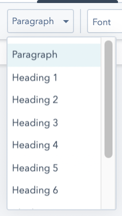
Header tags tell search engines which text elements are most important. For example:
Here’s a little more about the topic for people who like to read (in paragraph format).
Google will see the hierarchy of these tags and know to feature the H1 headline.
You should be able to easily set these header tags in your site editor. Here’s how this looks in HubSpot:

☑︎ Include Alt-Text for Images
Search engines don’t see pictures the way most people can, so alt-text helps describe your image. TIP: use keywords in your alt-text too. For example, if I wanted to rank for web design, I might use “web design” in the alt-text for this post’s featured image. In fact, I did. ;)
☑︎ Check your load time.
Studies show that your prospect will abandon ship if they have to wait longer than 3 seconds to get on your site. Yikes! So, how can you decrease load time to connect with more visitors?
Get a site checker like GTMetrix, WebPageTest, or Think With Google. These tools will show you which page elements could be slowing your site down.
Remember to optimize your images to increase load time, too. We’ve got more on that here.
☑︎ Make sure your site is mobile-responsive.
Over 50% of searches today are on mobile devices, and that percentage is only continuing to climb. You MUST make sure your site is easy to navigate on a smartphone.
If you use a hosted platform like HubSpot, your website will automatically be mobile-responsive.
If this isn’t covered for you, try a free responsiveness checker like this one from BrowserStack.
Great! A new visitor found your site. Now, how can you help them get where they want to go?
☑︎ Check your content.
1. Is it customer-focused?What are the top needs or questions your visitors have when they land on your site? Does your content address these concerns? Give this quick test a shot:
Count how many sentences that include “you” (the customer) vs. “we” or “our” (the company) on each page. The ideal ratio is 5:1 or better (refer to your customer 5 times more!).
2. Is it affirming?Can you include social proof (like reviews or client testimonials) to help your visitors see you’ve helped others like them?
Learn more about how to get awesome testimonials here.
3. Is it concise?
Keep your copy clear and easy to read. If you confuse your visitors, you’ll lose them.
Tip: remove or replace fluff words and phrases like “really” “in order to” (replace with “to”), “utilize” (replace with “use”), etc.
4. Is it correct?
Grammar and spell-checking are your new BFFs. Tools like Grammarly are fun for this.
☑︎ Check your navigation.
How easily can your visitors find what they’re looking for? Is the messaging in your menu clear? Keep it simple with menu items like “pricing” and “contact.” Your prospect will know what to expect if they click through to any of those pages.
☑︎ Check your links.☑︎ Check your design.
☑︎ Optimize your landing pages.
Make sure your landing pages have a clear CTA and no easy access to your main navigation. You have one action you want your visitors to take, so don’t allow them to become distracted by other links here.
☑︎ Check your forms.
Tip: Some website platforms have built-in automation for form responses. You can read the breakdown for each one here.
You've connected with your prospects and captured their info. But will they become your customers?
☑︎ Check your analytics.
How many of your site visitors became customers? How did they find you? Integrated analytics is essential for this.
Traffic analytics also show you which pages are performing best. For example, a page with a high bounce rate could mean your visitors aren’t finding the answers they’re hoping for, and it’s time to rethink the content on that page.
Google Search Console is a free tool that can help you get started with analytics. If your website is brand new, remember it may take some time to get enough data to show up here.
If you’re using a hosted platform like HubSpot, you’ll have built-in analytics at your fingertips to track your progress over time.
Don’t worry if it takes weeks or even months to see improvements - this is normal. You’re playing a long game.
That wasn’t so bad, was it? Now you have some tangible tips to keep your website connecting with, capturing, and converting your visitors. Keep them top of mind, use their questions and needs as your guiding star, and you’ll be crushing your site audits with ease.
Did you know you can take this list with you? Grab your free copy of our website audit checklist for captivating websites. Just drop your info below:

Frustrated with your outdated website? You may get the vibe that your lack of data or user experience is creating more roadblocks than it’s helping.
.jpg)
Ready for a new website? You may consider outsourcing to a designer or developer (or both)*. Read on (or take this quick quiz) to learn the...

Wondering which website platform is right for you? I’m here to help you weigh the pros and cons of a few key players: WordPress, Squarespace, and the...