5 Things to Ask Before Creating Your Website
Ready for your big and exciting new website design? Before diving into the fun of drag-and-drop editors and page layouts, make sure you’re building...
Take full advantage of the new and improved HubSpot CMS experience with the CLEAN theme.
Have a question and looking for an answer? I've likely got a video for that or an article that covers it.
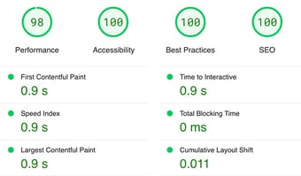
Google PageSpeed Insights is the gold standard in analyzing the speed and performance of a website. Here is how CLEAN Pro ranks. Not too shabby for a media-rich page.

Report generated: Tues, March 7, 2023, based on Home Page - Opt 1.
.jpg)
Time for a website redesign? You’ve got an exciting opportunity to rethink some of your branding elements. But with a whole rainbow of options out there, where do you start?

The good news is there isn’t a wrong answer here. But there are a few things you’ll want to consider to help your brand put its best foot forward. You’re about to learn:
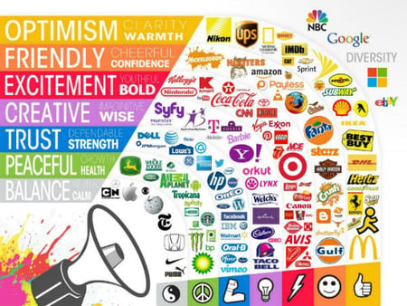
Colors evoke emotion, so ask yourself: how do you want your website visitors to feel? What do you represent? If you’re a fun, friendly brand, warm colors like orange are a great fit (oh hey, HelpfulHero!). Orange, yellow, and red can also induce hunger (think McDonald’s, Burger King, Sonic, or any fast food restaurant).
Cool colors like blue feel reliable and trustworthy (think Dell or IBM), while earthy tones like green or brown represent health and work for natural brands (like Whole Foods or John Deere).
Here’s an image to help you visualize different colors and their associations:

And, if you want to get into the nitty-gritty of your brand’s identity, check out our brand canvas.
Got a color picked out? Sweet. Here are some tools to help you build an eye-catching palette.
Canva’s color wheel is easy to use. Just plug in your primary color hex code and play around with a few different looks:
Complimentary colors
Complementary colors are two opposite colors on the spectrum (like purple and green, for example). They provide a good amount of contrast: perfect for CTAs and other elements that need to pop.

Monochromatic colors
A monochromatic palette is a little more subtle since it includes three shades, tones, or tints of one base color.

Analogous colors
An analogous palette contains three colors within the same family (found side-by-side on the color wheel). If you go this route, use proportions wisely so that the combination doesn’t become visually overwhelming. We’ll get into the how-tos of this in a minute.

Triadic colors
A triadic palette contains colors that are evenly spaced on the color wheel. The third color adds a little more balance and versatility to this palette while still providing a good amount of contrast.

Tetradic colors
Similarly, a tetradic palette has four evenly spaced colors on the color wheel. To avoid searing the retinas of your website visitors, you’ll still want to choose one dominant color and use the other three as accents.

If you’ve already got a mood board or general idea for your brand’s look and feel, Coolors is a tool that can give you a great starting point. Just plug in a photo, and Coolors will highlight its colors, hex codes, and all. You can hover over the image and move your mouse around until you see a color palette that feels right.
If you’re not into their suggestions, head to their trending color palette page and check out the options there. You’re bound to find something.
So how do you apply all of this to your website or marketing materials? Meet your new guide: color hierarchy.
Here’s where you’re going to decide how much of each color to use to create a balanced and engaging look. But what percentages should you use?
You’re in luck because your work is already done for you in this handy Photoshop template.
Go ahead, open it up. You’ll see five colors in the example (taken from this trending Coolors palette). The dominant light color (largest rectangle) will take up more website real estate (like your site background). The second-largest rectangle on the right could be a great highlight color (for CTAs, etc.). Your dark tone (a good choice for text in contrast to the light background) would be the third-largest, and any remaining colors would be used minimally and have the least amount of visual weight.
Make a copy of the template and edit those colors to your heart’s delight.
A quick overview with tools to help you get started on your new brand color palette. There’s a whole lot more down the branding and color rabbit hole, but at the end of the day, remember to have fun! Stay true to you, and your authentic brand will shine through.
.jpg)
Ready for your big and exciting new website design? Before diving into the fun of drag-and-drop editors and page layouts, make sure you’re building...

Need inspiration for your next PDF booklet offer or lead-capture landing page? Searching for good examples can feel like finding a needle in a...

Need to spin up a quick landing page? If you’re on HubSpot’s Content Hub Pro subscription, the “Start with AI” option can produce copy, layouts, and...