How to boost your website with HubSpot themes
HubSpot’s CMS is a powerful hub for designing and organizing your web content. For those of us non-developers, though, the idea of learning this...
Take full advantage of the new and improved HubSpot CMS experience with the CLEAN theme.
Have a question and looking for an answer? I've likely got a video for that or an article that covers it.
Google PageSpeed Insights is the gold standard in analyzing the speed and performance of a website. Here is how CLEAN Pro ranks. Not too shabby for a media-rich page.
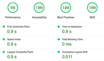
Report generated: Tues, March 7, 2023, based on Home Page - Opt 1.
4 min read
![]() Kevin Fremon
:
October 17, 2019
Kevin Fremon
:
October 17, 2019
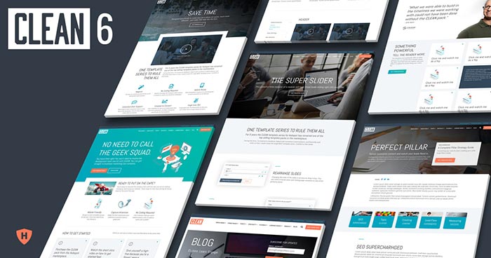
I couldn't be more proud to release the latest evolution of my template series for the HubSpot platform, CLEAN 6. Over the years I've continued to improve and evolve each of the templates by listening to your feedback and requests. Let me tell you about some of the awesome new improvements you'll experience.
In previous versions of CLEAN, there was very minimal coding required but you would still need to access and edit the master CSS file in order to edit your global styles such as colors, buttons, fonts, etc.
Not any more! Drum roll please...
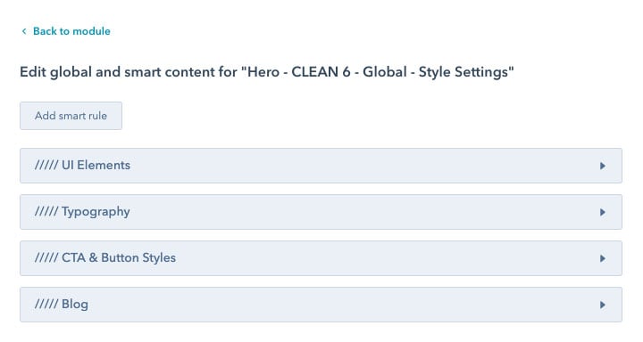
Now, you have full style control over various UI elements like icons, links or the little divider accent line, without touching a lick of code.
One of the most common requests I received from CLEAN 5 customers was in regards to adding in custom fonts and editing font styles. Once again, this required editing the CSS file which can be a tad bit complicated for someone who's not used to looking at code, even with all the documentation I created.
Not any longer.
Now you have full control over your typography from this glorious, glorious custom module. For example, you can now adjust these settings:
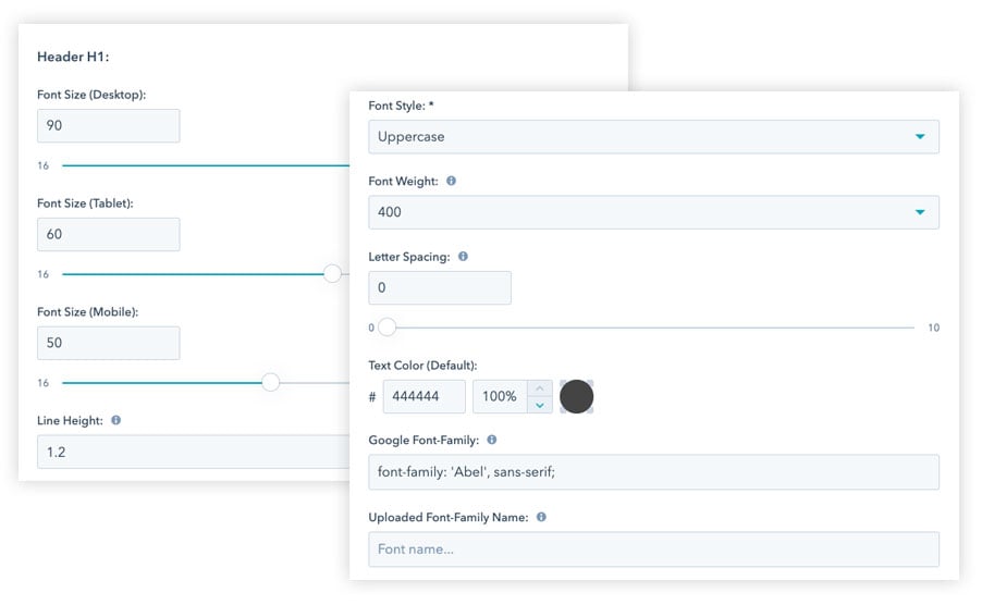
Pretty cool, right? Yeah, I think so too!
You will also have just as much style control when creating the look and feel of your CTAs (buttons). These options include:
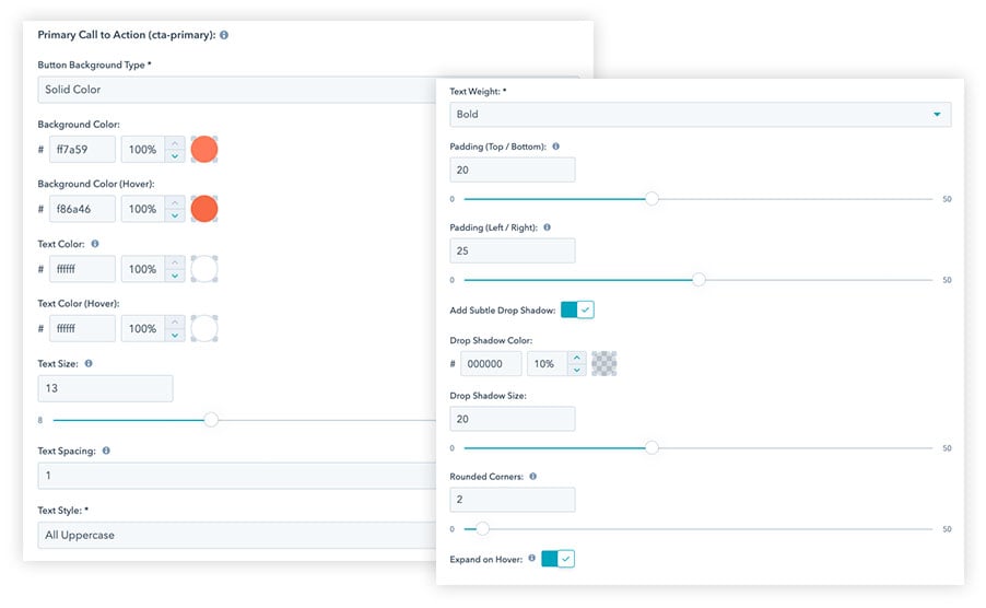
You get this level of control over three main CTA styles (primary, secondary and tertiary) so that you're able to easily apply visual priority to certain buttons on the page. Also, you have the ability to separately style your form submit button along with an alternative version that you can select from certain custom modules.
With the blazing fast internet speeds we experience today, utilizing background videos is becoming more and more popular in web design.
With the CLEAN 6 - Hero - Banner you can add multiple video clips that will automatically play one after the other. This means if you don't have a fancy, produced and edited video, you can easily grab stock video clips (demo clips from Dissolve) and string together your own videos with ease.
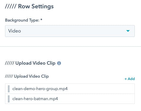
Wait, there's more!
With this update, all background videos will also play and look great on mobile devices and tablets!
I've taken a great deal of care and attention to detail when creating the experience you will have when working with each of the CLEAN custom modules. Each module now has greater consistency giving you the ability to know exactly where to find each of the many settings available. You'll be sure to notice how much this will speed up your workflow when creating or editing pages.
As an example, here are three different custom modules included in the CLEAN series.
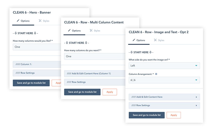
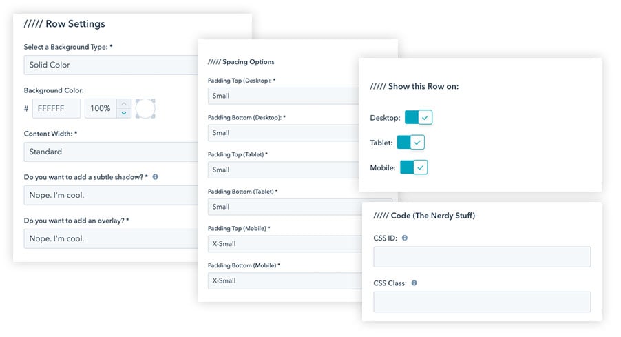
Each row module now comes with consistent row settings that you can customize in order to create beautiful and unique layouts. These settings include:
Giving you ultimate control of how your content is displayed was one of my top priorities when building CLEAN 6. Instead of having a variety of different custom modules to keep track of when you want a specific column layout, these options are baked right in.
In many of the custom modules used throughout the CLEAN series you will now have options to select how many columns you'd like to show AND the column size arrangement.
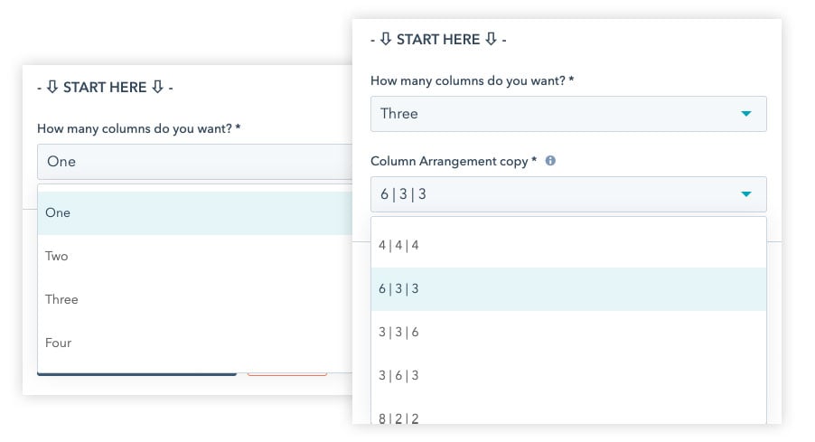
Not sure what those random numbers under column arrangement mean? No problem.
The CLEAN series is built on a 12-point grid system. That means, that the size of each column in a given row, when added up, must equal 12.
In the highlighted example above ( 6 | 3 | 3 ), the first column would take up half of the row and the other 2 columns would take up the other half but split equally. 6 + 3 + 3 = 12
Make sense? Cool.
Creating translated web pages in HubSpot is relatively easy. From the CMS you select "Translate Page" and voila! You get a new version of the page that you can drop your translated content into.
However, in most cases you're stuck with global elements like your main navigation bar that's in your default language. In most every (other) template scenario you'll have your work cut out for you and have to clone and keep track of modules and templates to support each language.
What a NIGHTMARE!
I've got good news! I've solved that problem and turned that nightmare into a sweet, sweet dream. You know... The type of dream where you're able to fly. Love those dreams!
From within the global header and footer module you can now add as many translated elements as you like without having to clone a single module.
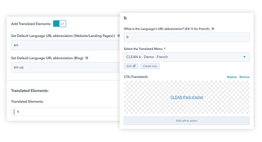
Is your mind blown? Thought so. :)
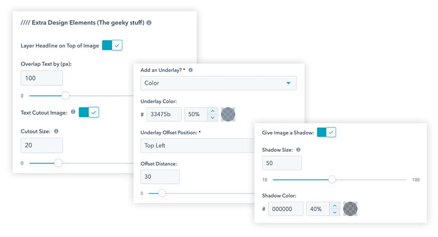
Who doesn't love a few extra design options to help make your website unique and eye catching? In select modules you'll have the option to add a little extra design based on modern trends.
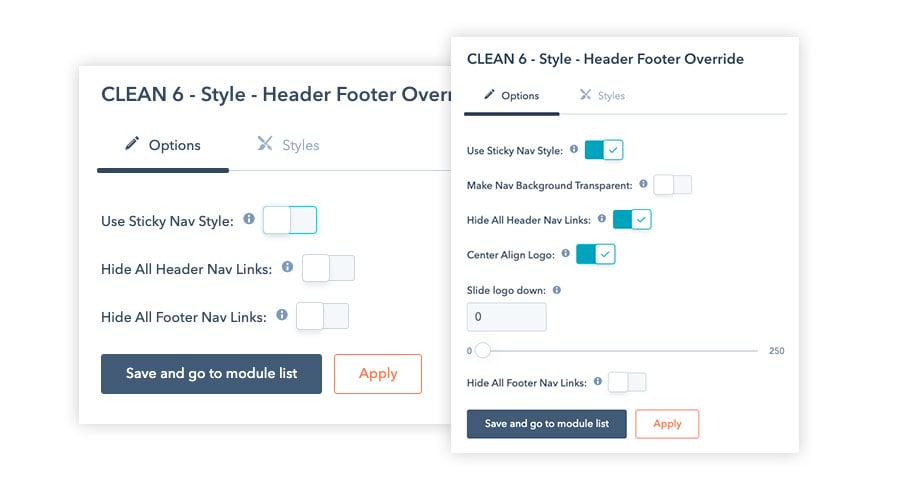
Each and every template contains a header and footer override module that can come in very handy as you're building out different pages.
For example... Let's say most of your pages have a hero image and your main navigation links are white but you've created a new page with a simple white background and no hero image. No problem. There's a toggle for that!
Just flip on the "Use Sticky Nav Style" option.
Maybe you're creating a landing page and you want to hide all the header and footer navigation links to reduce the "choice ratio." No problem-o! There's a toggle for that too!
I consider CLEAN a work-in-progress. Ever improving. Ever evolving. Just like a quality product should. This is why I value and appreciate every customer who has chosen to go with my CLEAN template series for their HubSpot website. It's with your feedback and requests that I'm able to continually make the best and most flexible template system for the HubSpot platform.
It's also why I intentionally choose to make every new version of CLEAN a completely FREE upgrade for past customers.
With massive amounts of gratitude I thank you.

HubSpot’s CMS is a powerful hub for designing and organizing your web content. For those of us non-developers, though, the idea of learning this...
Updated: 11/14/22The fun of creating landing pages is that it gives us the ability to experiment with design, copy, offers, etc. in order to capture...

Do you ever find yourself wishing you had more than 24 hours in a day? You may feel overwhelmed or exhausted, or you may have told yourself that if...